My medium for producing scores, as a cursory survey of my compositions should make immediately clear, is pen and ink. This has been the case for about twenty years, when I switched from pencil after the strain on my wrists got to be too much and I wanted sharper, more regular lines. For all of that time since, I’ve used technical pens; but after mine all became hopelessly clogged I switched, as I mentioned previously, to a very old Pelikan Graphos.
As I’ve been learning to use this pen, I’ve realized that my skills with drawing are sorely lacking, so I’ve been studying (read: watching a bunch of YouTube tutorials) about various aspects of pen-and-ink drawing techniques. It’s a wildly complicated field, with all kinds of details like varying line weight, different kinds of cross-hatching, various tricks to mimic engraving, to say nothing of all the different styles of drawing and the technical skills needed to execute them.
I promised I wouldn’t turn this into an art-hobby blog, but working with this pen as I try to learn such detailed, nuanced techniques has made me realize just how much graphic scores, even the most lavish ones I’ve studied, tend (at least in their visual aspects) to be the opposite of detailed or nuanced.
Notation and the Symbolic Image
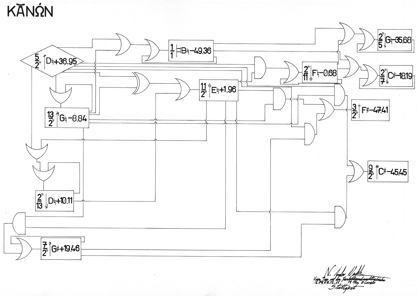
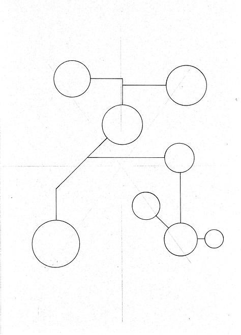
This score was based on a conversation I had with Charles Curtis, cellist, about how he prepared performances of La Monte Young’s “The Second Dream of the High-Tension-Line Stepdown Transformer, from the Four Dreams of China” (Young’s titles are frequently rather long). Curtis pointed out that Young originally wrote the score as two lists of combinations of pitches from a four-note chord: those that were acceptable, and those to avoid; but it’s actually much simpler to play if, rather than memorizing all the chords, you remember a couple of very simple rules, mostly intended to avoid producing a major third in the resulting combination or difference tones. So I drew up this score, conceived as a set of if/then/or/not gates to govern which pitches might be played in which combinations.
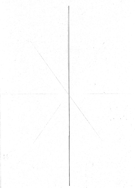
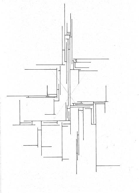
But what’s notable here is that the visual language of the score is still largely that of a symbolic system: the various shapes on the page have specific, discrete meanings, where a certain combination of marks on the page always means something and only that thing.
If you look at any of the scores from the postwar avant-garde that I talk about as exemplary of a venturesome compositional spirit (Treatise by Cornelius Cardew, Konstellationen by Roman Haubenstock-Ramati, Anastasis by Anestis Logothetis, Plus-Minus attributed to Karlheinz Stockhausen but conceived by Mary Bauermeister and executed by Cardew), they tend to follow that same logic in their visual repertoire. Specifically, they all operate (excepting the case of Haubenstock-Ramati’s Konstellationen, which has watercolor backgrounds and two-color printing) using one solid color against a blank background. They’re conceived as symbolic systems rather than pictorial ones, in that the marks on the page function in the way the characters of this text do: as symbols that refer to units of information (in the case of this text, lexical units; in the case of a score, musical ones). They do not depict something, but refer to it (even though the musical material to which they refer is ambiguous or unspecified). Furthermore, their overall layout presents as a flat plane, with all marks sitting on its surface and no distinction between foreground and background.
I have a suspicion that this derives from two traditions that still exert a strong but subtle influence on the graphic-design choices those composers made. First and most obvious is that of conventional music notation, which functions as a symbolic medium similar to text.1 The second I believe derives from a number of the composers I’ve talked about having backgrounds or even formal training in graphic design, where technical drawing tends toward the perspective-less and diagrammatic.
A third factor we might also suspect is a trend in art criticism of the mid-twentieth century, led by visual-arts critic Clement Greenberg, that considered the “formal facts” of a given medium to be the chief domain of its expression. In the case of painting (Greenberg’s focus), the flat plane of the canvas was its chief characteristic, and thus (at least as he argued) a painting should be chiefly concerned with expressing this flatness, rather than dissembling it through pictorial illusions of depth or perspective (for this reason he considered Rothko and Pollock to be exemplary of “good” or rather “authentic” expression of the painterly art).
Musical Scores beyond the Symbolic
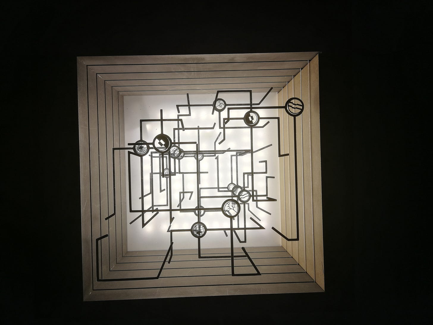
I’ve already produced a couple scores that exist as physical objects beyond sheets of paper with marks printed on them, like these illuminated boxes. One of the scores I’ve been thinking about making would be a similar construction, but made with stained glass and with no back wall, so the performers might use it to view the performance space beyond.
Between that concept and my recent adventures in drawing with pen and ink, and with the upcoming addition of watercolor, I’m beginning to think that the flat, planar surface with marks on it performing a symbolic function is going to be inadequate. So here we arrive at the problem I’ve been mulling over: how do you produce a score that isn’t symbolic in the black-and-white manner of these scores, but also isn’t pictorial?
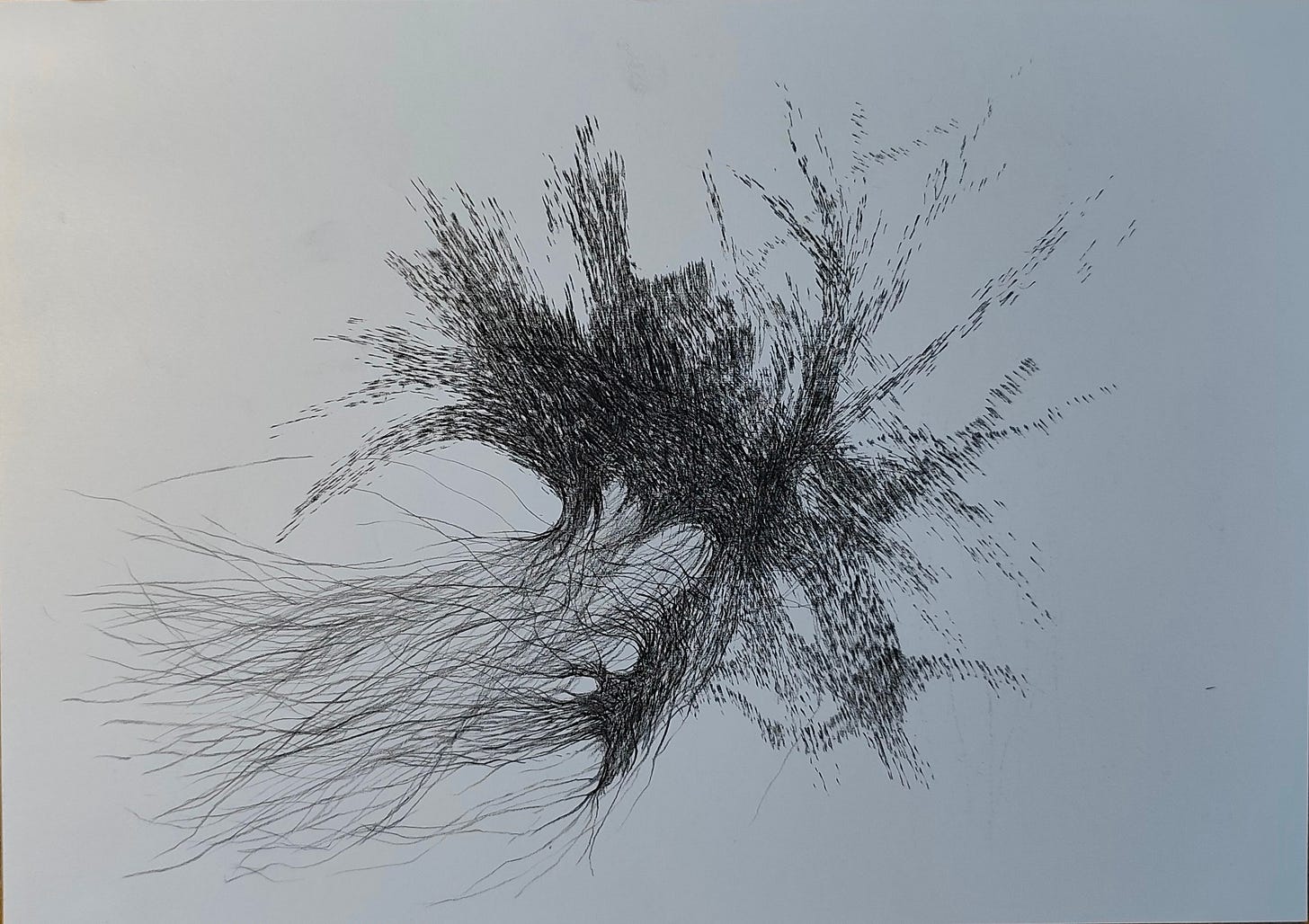
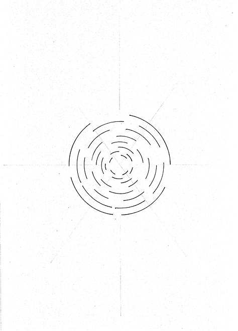
Put another way: I still want my performers to read the score, and not improvise inspired by it. The impulse driving their actions should still originate in the score, not their own internal processes. But I’m also trying to get away from the idea of visual information in a score operating strictly as a binary between this and not-this. Adding extra dimensions of visual information—color, shading, texture, medium—forces performers to think about that information more organically. The line art at the top of this essay is a good example of how that could be achieved even just using black lines on white paper; another good example is an animated score by an old friend of mine, Casey Farina, viewable on Vimeo:
Here, there are simply too many elements at once to treat any one of them as a symbol referring to a single concrete action; you can’t “play the line,” following its contours as if it’s just a more-abstract form of notation (what I’ve described previously as “musical graphics”). You might still be “reading” the score, but not in the digital, atomic sense of translating each mark on the visual plane as a discrete unit of information that has a definite realization in sound.
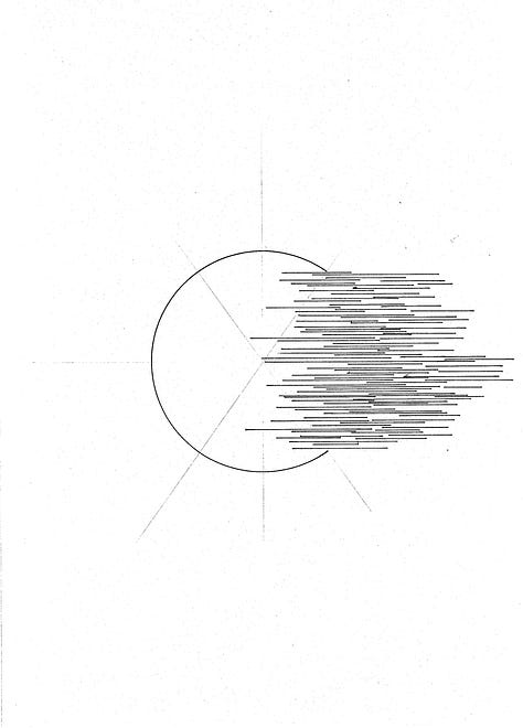
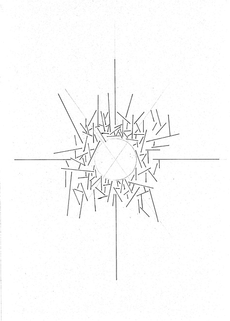
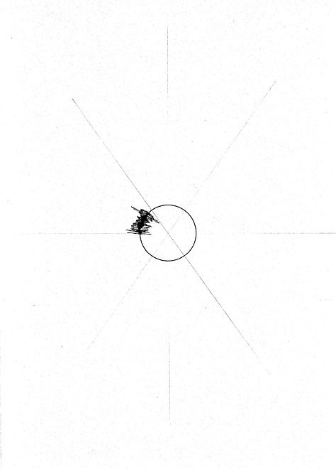
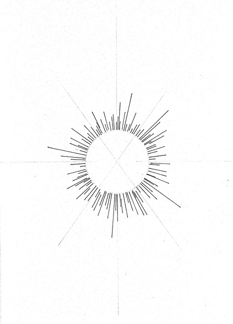
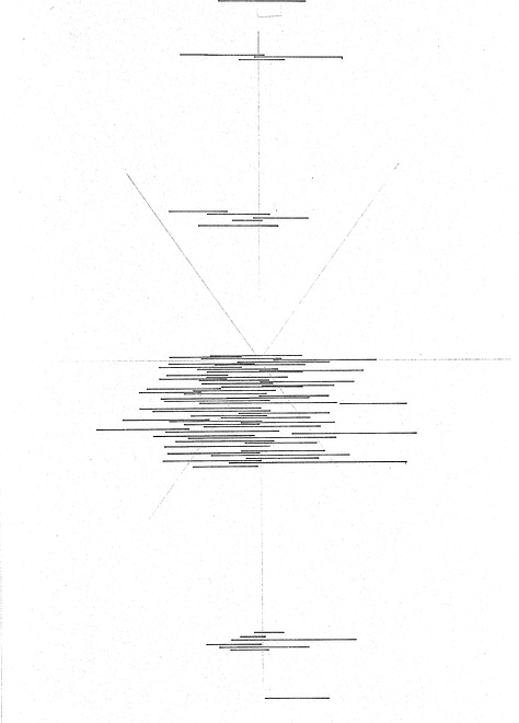
There’s some equilibrium I think I’m trying to reach here between a strict “reading” of a score as a symbolic system and a freer, improvisatory “interpretation” of it as a coherent whole. I’m struggling to find even the appropriate language to describe what I’m seeking, which (if past is any guide) is a good indicator that there’s something interesting to be found there, whatever it is.
But it’s important to note that neither notation nor its musical realization “is” text, despite a long and dubious tradition of musicologists trying to frame it as such.


