

If you study the graphic scores of the postwar avant-garde, you may note that many have a characteristic look to them. I’m thinking particularly of scores from Roman Haubenstock-Ramati and Cornelius Cardew (which latter would also include a number of scores by Karlheinz Stockhausen, because Cardew did the draughting1 work for him), which often have the feel of engineering diagrams.
This is not an accidental resemblance: both Haubenstock-Ramati and Cardew were trained in graphic design, and if their education was anything like what was historically typical, they were familiar with the draughtsman’s tools of the time. They would have used ruler, compass, and stencil, and been familiar with the methods of technical drawing.
But what is interesting to me here is that the tools of technical drawing throughout most of the 20th century were not the ones we now use. In particular, the pens we now use for technical drawing—I’m looking over at my box of Rotring and Koh-i-noor technical pens, but I’m also thinking of those fiber-tipped fineliners you find in art stores—are a relatively recent invention, only coming into widespread use in the 80s and 90s. Before that, technical drawing was accomplished with two different kinds of pen, both of which are decidedly old-school.
Ruling Pens
The basic tool for technical drawing since the 17th century is the ruling pen: a relatively simple tool comprising two pointed tines held at a specific distance with a screw. Ink is fed into the gap, and flows out at the tip. The advantage of these pens over earlier quills is that the line thickness could be adjusted, was consistent, and could be made extremely thin. Because the barrel was relatively thin, they could also be mounted to a compass for drawing circles.
For nearly three centuries this was the pen used by architects, shipbuilders, engineers, cartographers, and in any other technical field. They’re mainly used today by artists—they’re used in watercolors to lay masking fluid, for example—but you can find all kinds of secondhand draughting sets that have them.
I’m still looking at one set right now that includes a number of different compasses, as well as a couple ruling pens. I might still buy that in a couple months, but my focus right now is the pen that replaced ruling pens throughout most of the 20th century.
The Pelikan Graphos
If you do any kind of ink drawing work (such as drawing for comics), you’re doubtless familiar with the line of Rapidograph and Isograph technical pens, made by Koh-i-noor and Rotring, respectively. Both brands work on the same principle: a narrow-bore metal tube at the end, with a thin metal wire running through the middle, attached to a shuttle back in the barrel of the nib where it connects to the ink reservoir. Here’s my collection:
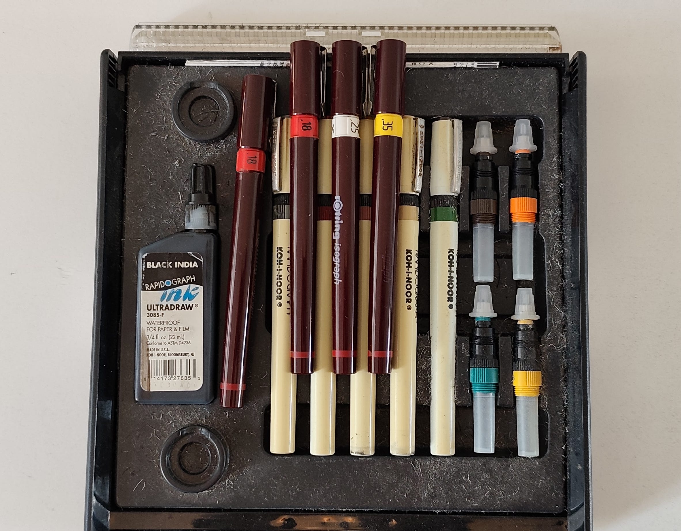
The problem with these pens, I’ve found, is that they are extremely tiresome to clean. The narrow confines of the nib and shuttle mechanism allow for ink to dry relatively quickly, clogging them. You have to keep them soaking in pen-cleaning fluid, and even then you might find periods after prolonged storage where the only way to clean them is with an ultrasonic cleaner. I have two of the red Rotring pens because one of them became so hopelessly clogged I just gave up and replaced it.
These pens were developed in the 80s, and I can only think of one real advantage they might have had over their predecessor: if used constantly to keep the ink flowing they almost never drip, only laying down ink when they touch the paper. But in every other respect I dislike them: they are cheaply made, with the plastic body cracking at a number of points, and have the feel of something disposable (despite new ones right now costing nearly €60). They are high-maintenance, fussy tools. I started this journey into older pens because I spent weeks carefully soaking the nibs, to no avail (and, as I learned, if you disassemble the nibs completely to clean the interior, it’s almost impossible to reassemble them without bending the wire, further jamming the mechanism).
And so, much like my earlier abandonment of the modern tools of computer-notation software (at least for my own work; I still avidly use Lilypond when doing typesetting for others) in favor of hand-drawing all my scores, I’m now reverting to using the pen that Cardew and Haubenstock-Ramati almost certainly used in their own work, a decidedly strange tool that’s taken me decades to discover but, now that I have it in hand, I can’t believe isn’t the pen for drawing and draughting work. Behold:
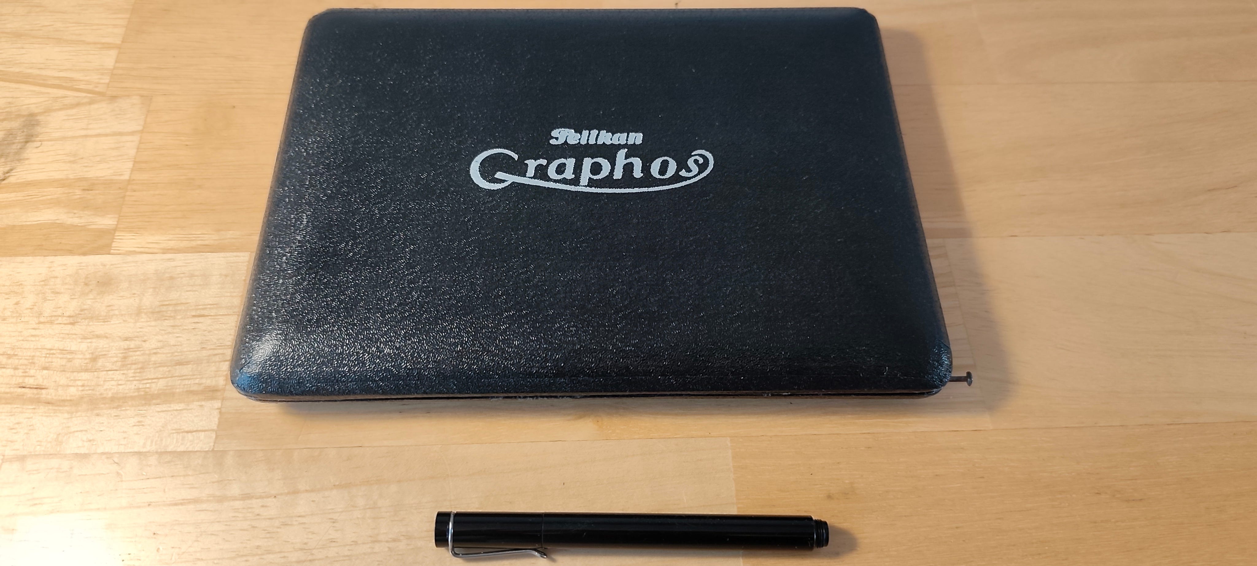
This looks pretty unassuming (and the pen itself is quite small), until you look at the pen body itself:
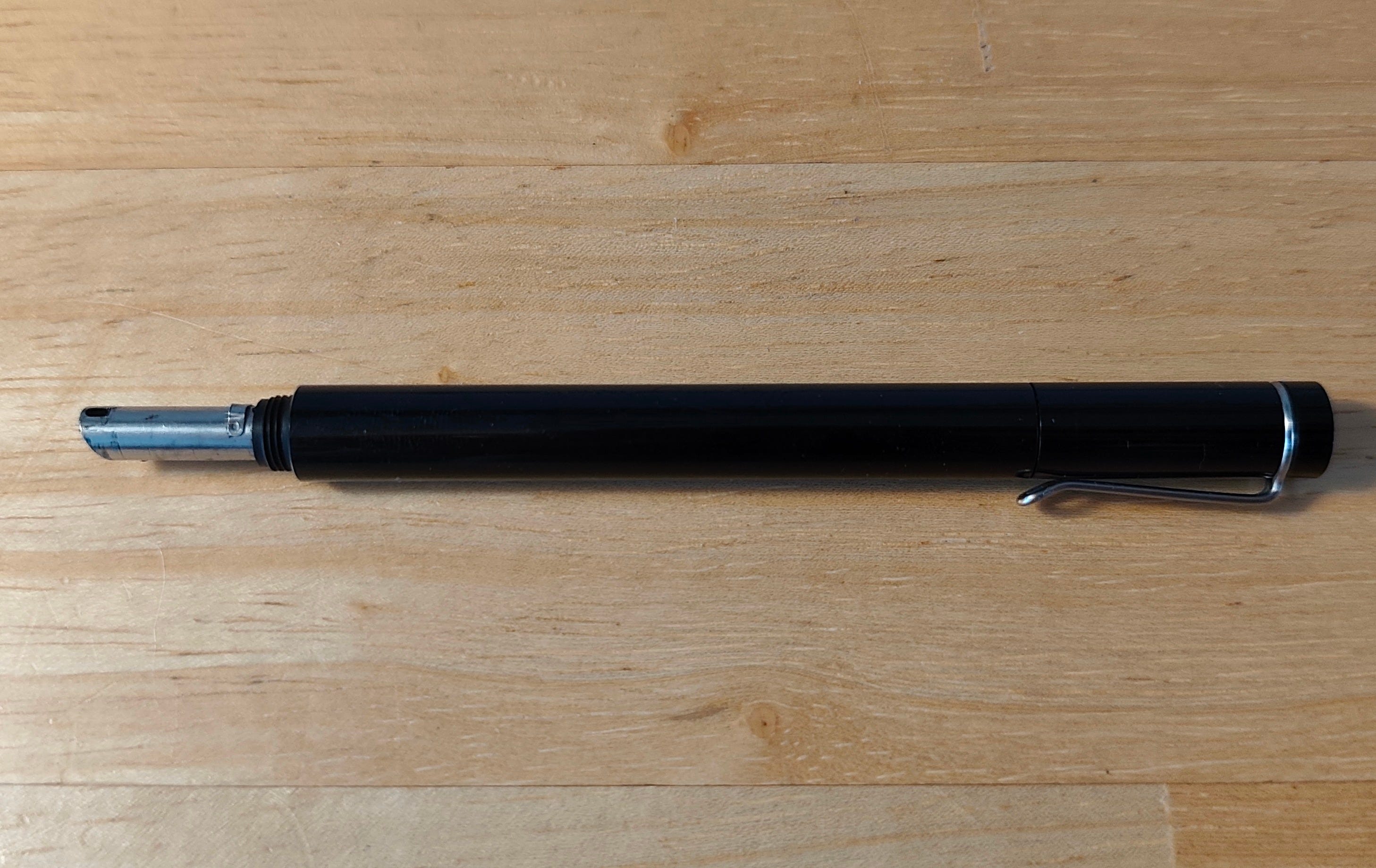
That isn’t the actual nib on the left, and it’s here that we dive down the rabbit-hole and discover that this isn’t one pen, but actually more than sixty. Here are the nibs:
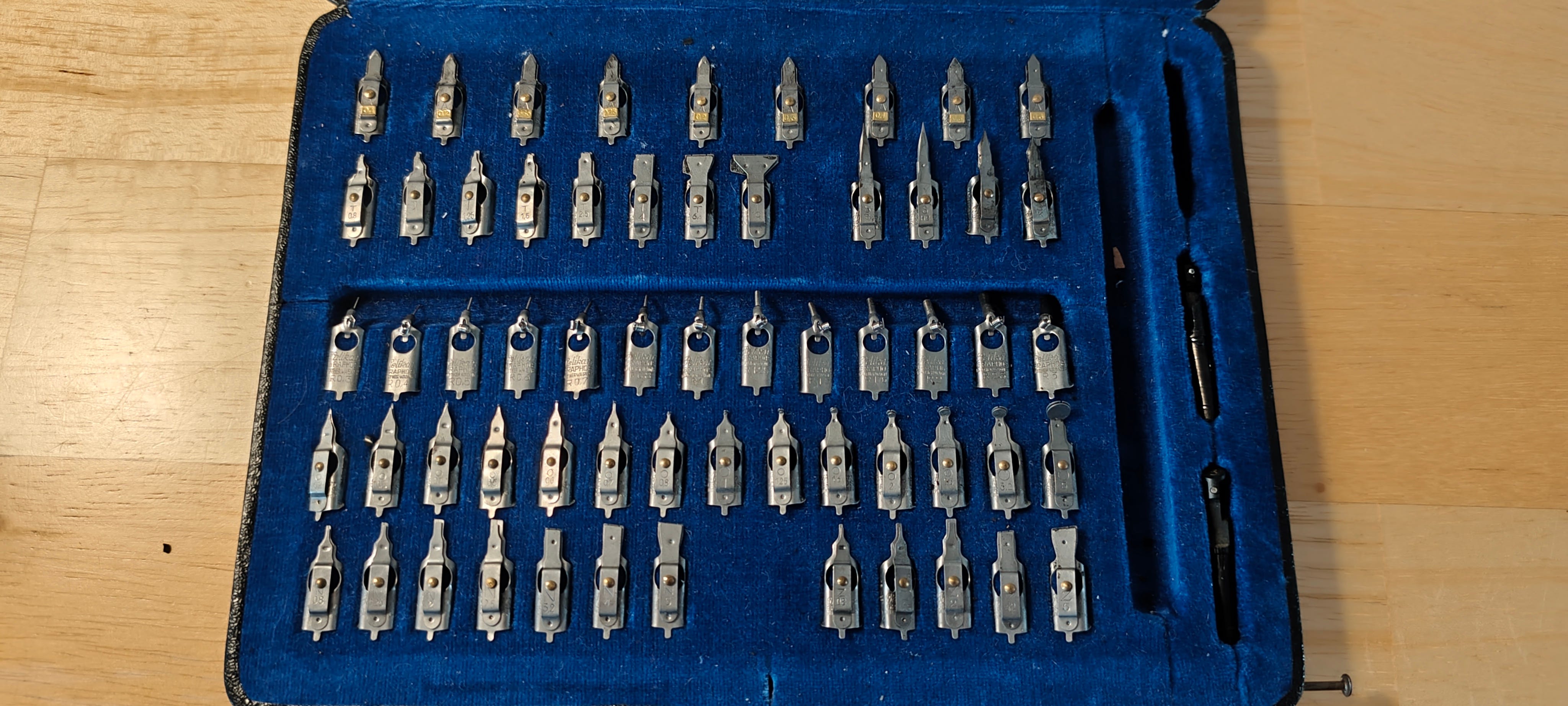
And here is the explanation for what they all do:
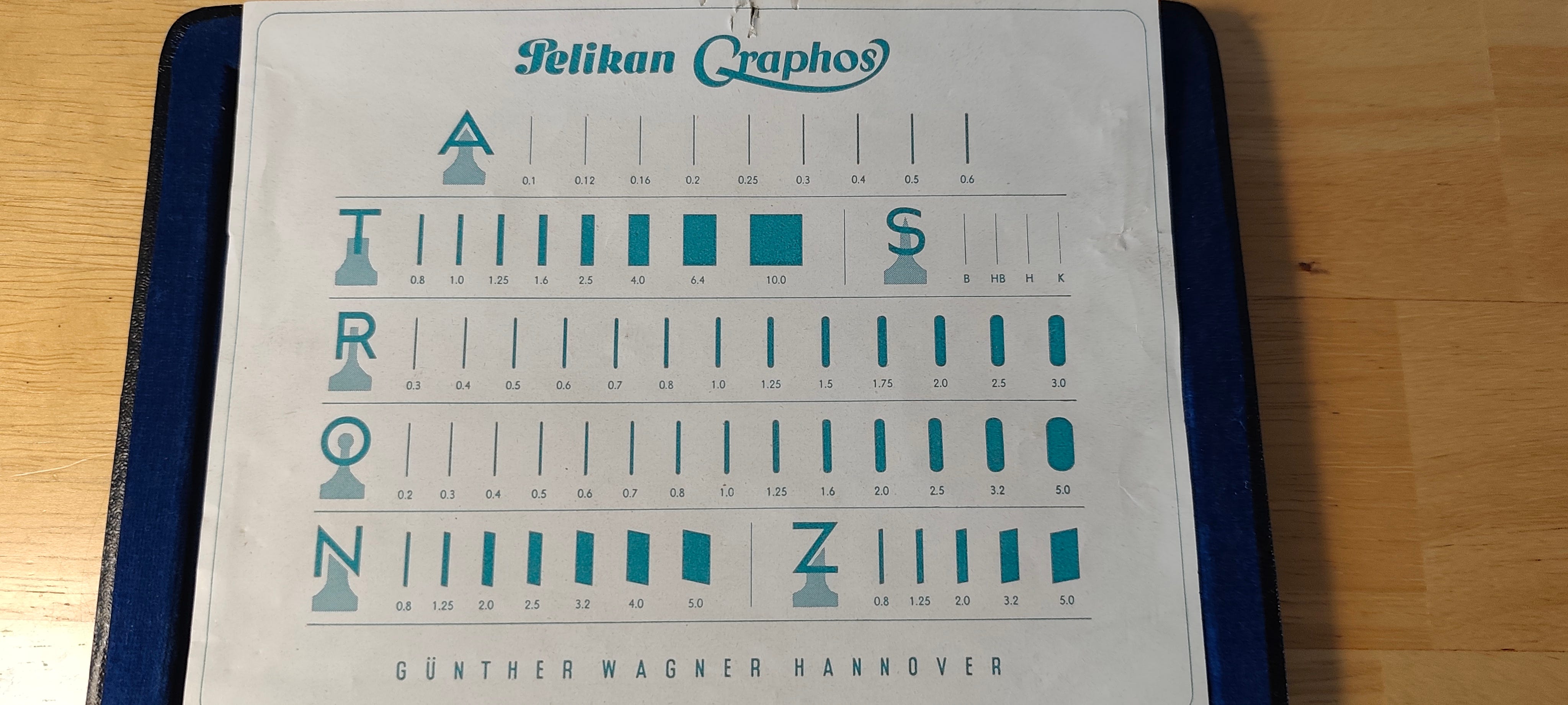
The A-type is made for ruling lines, replacing the ruling pens I talked about above. The T-, O-, N-, and Z-types are all for various profiles of drawing thicker lines, the R-type is for stencils, and the S-type is for freehand sketching. The way it works is that the nibs can all be swapped onto the same barrel, which is fit with one of three ink feeders (that’s the three plastic pieces on the far right in the case, though the one in the middle slot was actually in the pen when I got it and was so degraded by ink that it crumbled when I tried to pull it out) for different rates of ink flow. There are a few explanation videos on youtube that demonstrate how they all look on the page, so I’ll not get into that here.
What’s so fascinating about this pen is that all the parts are very simply made, and quite robust. The R-types, for stenciling and most similar to the technical pens, lack a central feeder wire, so there’s no narrow channel to clog: in fact, they also each come with their own removable cleaning wire (those are the things that look like springs), to clean out the channel after use. Most of the nibs hold the ink between two blades of metal, with the upper one able to rotate so that the entire mechanism can be cleaned after use; unlike the Isograph, there are no inaccessible internal components that might get gummed up.
Using the Graphos
There are definitely some quirks to this pen, though: for one, removing, switching, and cleaning the nibs can get very messy, so you do need to be methodical about working with them away from your drawing surface and plan to come away from your desk with ink stains all over your fingers. I’m also still figuring out how to use the sketching nibs, as they don’t seem to flow very freely (though that might also be because I’m using some old printer paper that isn’t made for this).
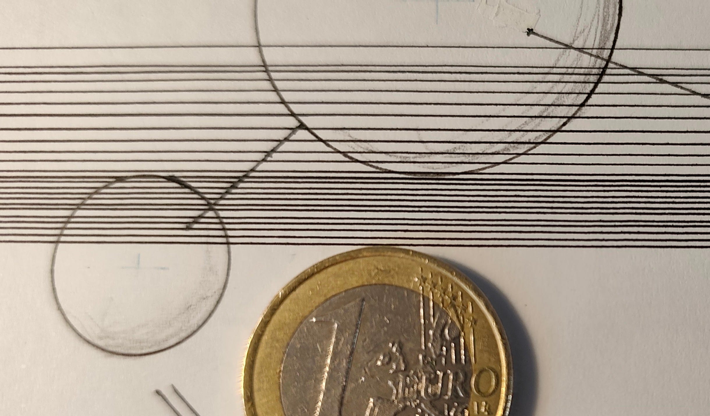
But on the other hand, the lines I can achieve with the A-type are far crisper and more regular, and thinner, than anything I could achieve with the Isographs. The finest nib I used with the latter was 0.18mm, and that was the red-band one that kept clogging. The A-type here goes down to 0.1mm, and the lines are much more consistent:
Also, I’m discovering that you mostly use a very light grip when using this pen, even lighter than with the Isograph; one of the reasons I started using pens in the first place was to reduce the strain on my wrists, so this is a great improvement. Also, I’ve learned that all my lettering stencil sets are sized to specific nibs, which means that I only need to trace the letters and the interiors are already filled (previously, I would trace the letters and then fill them in by hand, because I didn’t have matching tips), greatly speeding up lettering.
I still have a lot of practice to do with these various nibs, particularly the S-type (unlike all the other nibs, the S-types come in different degrees of flexibility rather than thickness, for line variation with hand pressure), but after even just a couple days of using this I really wish Pelikan were still making these. This set that I have is at least fifty years old, maybe more than sixty, and there haven’t been any made since 1978.
Fortunately for the aspiring designer of graphic scores, these pens were in such widespread use for such a long period of time that there always seem to be a few on secondhand websites, and replacement nibs can also be found (or you could just buy incomplete sets to scavenge for parts). This set was rare for being complete and in such good condition, but there are also smaller sets with eight or ten nibs that can be found.
Also worth noting is that Rotring took over the production in 1978 and immediately switched to using lighter plastics for the body, as well as adding a smaller, internal reservoir for ink (and then ended the production altogether in 1986). I don’t like the feel of the lighter pens, but that might be useful later on for having extra pens for specific colors of ink, separate from the black India ink in this one (which is stored directly in the barrel, so it can’t really be changed easily).
But I come back to what I said at the beginning: for all its messiness and idiosyncratic behavior, I still can’t believe there aren’t more artists working with ink who’d want a pen like this. For one, the only consumable is the ink, so you aren’t throwing away the entire pen (as is the case with those fiber-tipped fineliners, which have the added problem of the tip breaking down even before the ink runs out). It’s much more sustainable, and having all these different nibs gives a lot more flexibility in how you draw your lines, shapes, etc. I haven’t yet tried using one of the broader nibs for filling in large areas of black, or tried any of the shaped nibs, but the possibilities for achieving various visual effects in my scores seems much greater with this.
Rule Them All
I haven’t produced a pen-and-ink score in seven years, and it’s one of the gaps in my life that I have keenly missed: much like the other parts of myself that I consider essential, no being able to work like this has left me feeling like a part of me was missing. One of the really frustrating part of that work was that doing any kind of fine linework inevitably led to me having to draw a line multiple times due to inconsistent ink flow, scratching up the paper and leading to bleeding and other problems. Even with conventionally notated scores, most of the material on the page was ruled lines or curves, so being able to do those without shredding the paper will already make the experience much nicer.
But what I’m really excited about is going to be expanding my drawing skills to make use of all these different nibs, to put some work in to make scores that are visually beautiful, but also have a wider range of communicative power because of the wider range of visual expressiveness.


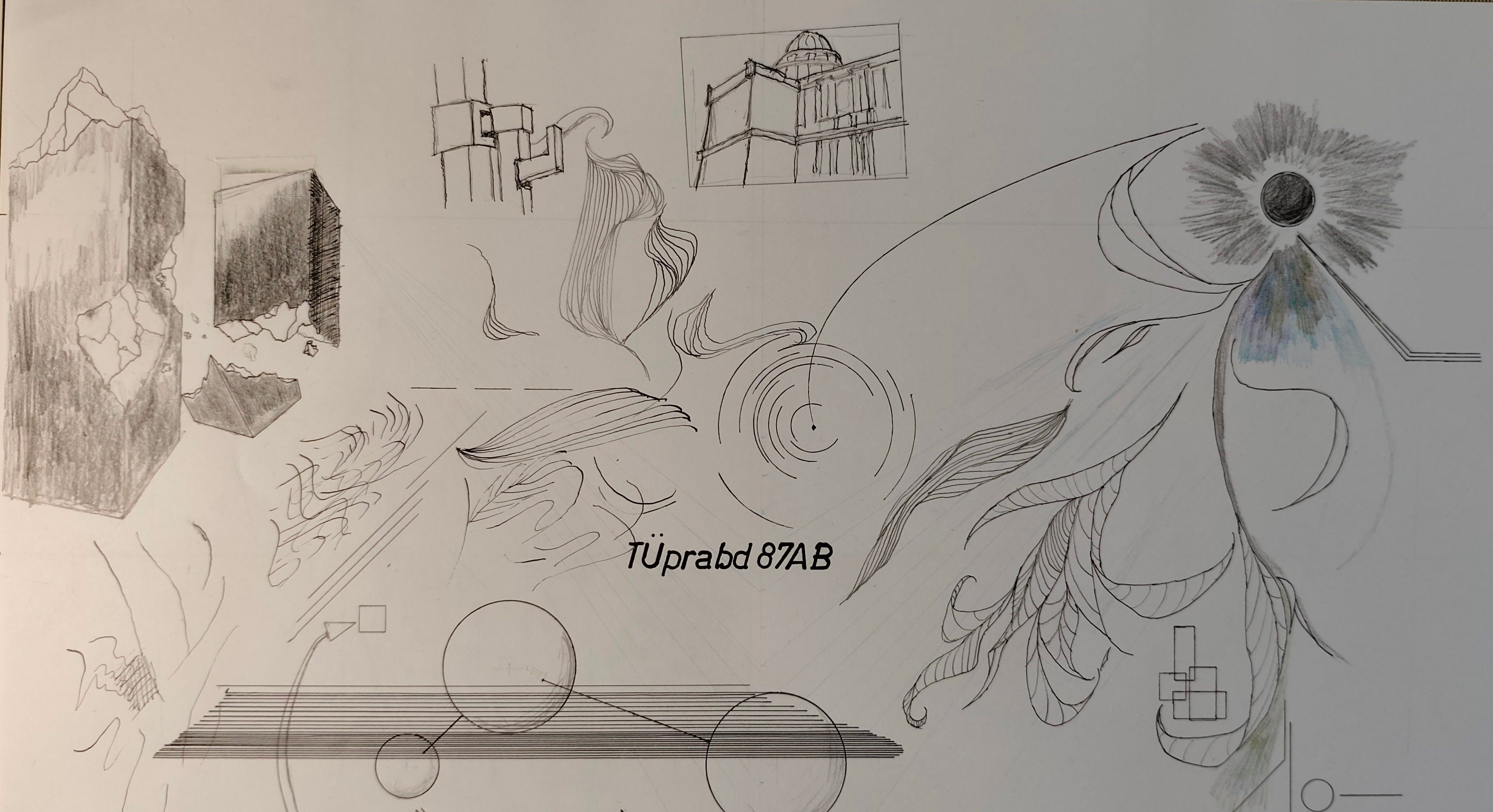
As complex as this score looks at first glance, from the visual side it’s pretty consistent. I like to think there’s more I could do with a score like this if I had more different line types, different stencil types, etc.
One of the things on my mind, since I wrote previously about performance instructions, is the realization that having too limited a visual repertoire risks reinforcing the belief that the score operates as a mostly digital carrier of information: that is, that the simple black-and-white score, with limited shapes, lines, etc., risks reinforcing the belief that each visual element serves to convey one unit of information, in the way that text or conventional notation does. This was why I argued in that essay that performance instructions for graphic scores need to tend toward the poetic, to be very deliberate about avoiding explaining the score in terms of translating specific marks on the page into specific, corresponding musical actions or events.

This is also the reason why my long-term project, of which this pen is a part, is to add other media as part of my scores: not because I want my scores to work as visual art independently (though they probably could), but because I want them to communicate their ideas through more than one channel, to operate on multiple levels simultaneously, because the musical ideas they convey require it.
Once again, it seems I dive down a rabbit-hole, and discover that the universe beyond is even bigger and stranger, with more to come.
I’m going to indulge in the archaic spelling of the word for technical drawing, pronounced like “drafting,” because it retains the similarity to the words “draw” and “drag” from Old English, and more closely resembles the German word for the same practice: “ziehen” for “drag”—the German word for a ruling pen is “Ziehfeder”—is related to the German word for drawing, “zeichnen.”